Wednesday, December 16, 2009

Steven Lopez


Steven Lopez is one of my all time favorite artists. He is notorious for combining traditional art elements with graffiti.His work is not famous but he is one of the most accomplished artists of all time in my opinion.
What I enjoy the most in his artwork is the artist's ability to combine abstract with representational images, creating a complex figures.Also, his use of color is just outstanding.
Everyone should check his artwork at http://ikeepmoving.com/

Athena by Claudia Drake

For one of my classes, I had to pick a piece of art and write a poem about it. I found Claudia Drake's Athena digital collage completely intriguing. For me, this image made me think of pealing someone's thoughts apart. What if you had the ability to just look inside someone's head and see their memories through their eyes. Here's the poem I wrote about it:

In a world where communication is tangible,
Language as we know it becomes obsolete
Our minds ripen like fruit, ready to peel
The layers of our being

Across the room is a prosperous man
He puts his head in his hands
and ponders in silence
The things he would never say
Become unwrapped like a present
Like the first present on Christmas
I pull away to reveal
The moments he treasures
The images once only for him

He blankets the death of his daughter.
Her youthful beauty lives in eternity
Within the fortitude of his mind

Outside there is a happy couple
The hold hands gently
while walking in the park
Who would question such love?

Like a fresh orange in the spring
I unpeel what's seen on the surface
The things he thought he hid so well
The memories he never shared

He sheds a matrimonial secret
His mistress's silhouette
Haunts the crevasses of his body

In a humanity stripped of assumptions
Revealing the beauty of truth

Ron Mueck's "Spooning Couple"

Ron Mueck's art is usually dubbed hyperrealism (Most of his stuff is larger than life-size). These sculptures (err, figurines?) have a life-sized feel to them, though in fact, they are smaller than my arm (see the real hands surrounding them for a size reference). Size aside, they seem miserable and perfect to me - like two ordinary people, oily and frustrated.

Caravaggio's "Amor Vincit Omnia"

I didn't truly enjoy Caravaggio's paintings until I saw this piece, entitled "Amor Vincit Omnia." The title translates to "Love Conquers All" (I'm fully aware of how cheesy that sounds, but in Italian, it sounds much better). Anyway, the church sought many paintings from Caravaggio as altar pieces, although each time, he insulted them by "de-glorifiying" famous saints and such. More importantly, at least to me, is the fact this particular painting lacks traditional gender standards (many of Caravaggio's paintings depict Bacchus-like males, but none so elegant as this one). I admire Caravaggio for painting whatever he wanted, instead of being a sucker for commissions like so many artists. More importantly, this painting is undeniably beautiful. It shows the male form as pure, playful, and semi-dainty. Oddly enough, the only other vulnerable male depicted in art that I can think of off the top of my head is Jesus Christ. It's strange that an entire religion can be based off of a man's vulnerability, but a large majority of art depicted thereafter of male mortals idealizes stoicism and muscle.

Tuesday, December 15, 2009

Judith Beheading Holofernes


Artemisia Gentileschi was an Italian Baroque painter and one of the most accomplished painters in the generation influenced by Caravaggio.She is an example for women by becoming the first member of the Accademia di Arte del Disegno in Florence. She was one of the first female artists to paint historical and religious paintings,when painting this themes was considered beyond a woman's reach.
The painting Judith beheading Holofernes depicts the murder of Holofernes by Judith and her servant. The painting is extremely gory and it contradicts with the image of innocent woman.The contrast in the shading and light creates a dramatic scene with extreme detail.
The painting is one of my favorites of all time due to the violent message and the role that had in the social life of Italy and the role of women in Europe.

In Search of Reason


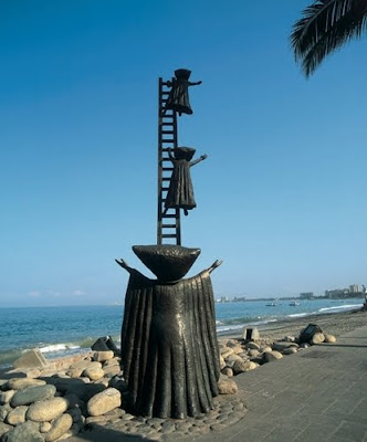
In Search of Reason is a statue made by the mexican artist Sergio Bustamante. I love Bustamante's work because it seems to me like creations of a child's imagination coming to life. He uses his creativity in a unique way that represents a fairy-tale like world of possibilities. This sculpture is located on the sidewalk of Puerto Vallarta, Mexico. I love how the figures in it, with their triangular heads and wizzard-like cloaks,  look like people from another world. To me it looks like the two figures climbing the ladder are reaching for the sky, as if summoning god, searching for some sort of meaning (hence the title.) I imagine that the figure on the ground is either calling for the others to return, or telling them to climb and find reason. I've seen many of Bustamante's statues, and this one is one of my favorites because of the way it makes you wonder who these strange people are, and where they came from.

Monday, December 14, 2009

Lucky Number 7 :D

This painting is Le bonheur de vivre (The Joy of Life) by Henri Matisse. I love the bright colors in the picture and how it depicts a certain surreal feeling with the wavy outlines/shapes. It shows people singing and dancing, and also people who seem to be in love. All of these things are some of the many joys in life. It allows your mind to escape for a while and picture a world where nothing would be negative, only happiness.

Impression Sunrise

This painting was created by Monet in 1873. It is great example of the style of painting called impressionism, because the Impressionist movement was named after this painting. This painting's subject is a harbor at sunrise. Monet uses very loose brush strokes in this painting which suggest rather than delineate it. The sun and the sky use the same luminiance. This relies on the use of contemporary colors, and color temp, rather than changing the color intensities or contrasts.

Sunday, December 13, 2009

Burning Giraffe


This piece of artwork was created by Salvador Dali in 1937. It would most definitely be described as surreal. It is a dreamscape in which a giraffe, set in the background of the piece, is burning. Its back is ablaze and it appears to have smoke rising from it. Front and center we see the form of a women. In Dali's interpretation, the woman stands with her arms outstretched. She appears to be stripped of skin and the viewer can see the muscles of her hand. However, as you follower her form down, it appears that she is wearing some kind of long flowing gown. You can see her feet from under it. The woman has drawers opening from her body. Her head has no face. To the left of this woman and in the back is another woman. This piece is seen as a premonition of war. The piece stands out to me because of its dream like imagery. Dali is a very interesting arist. The tall women, which almost mimic the length of a giraffe, and the burning giraffe itself are odd images. It leaves me wondering why Dali created such a piece.

Saturday, December 12, 2009

Ashes and Snow


Ashes and Snow is an art exhibition by the photographer Gregory Colbert. Colbert is my all time favorite photographer for many reasons. In 2005, my parents took me to see his traveling art exhibit in New York City. I instantly fell in love with the way he represented an extraordinary harmony between human and animal. He began working on this exhibition in 2002. The  photographs have been taken from all around the world in places like India, Egypt, Kenya, Sri Lanka, and tons of other locations. He photographs animals that I could only dream of being in the presence of. Some of the animals he uses in this particular collection are whales, leopards, elephants, orangoutangs, eagles, and more. As you can see from the two photos i posted, Colbert catches extremely rare moments of intense connections between humans and animals. He has an amazing ability to capture passionate photo's, that at the same time give you an overwhelming feeling of sensitivity. In the first picture, it looks like the child is reading, as the elephant listens. It seems as if somehow, the elephant can understand the boy, and waits in anticipation to hear the rest of the reading. In the second photo, the elephant is touching the ceramic pot with his truck, so gently that the pot is barely tipped to one side. I love how one boy is in focus, but the others behind seem as if they are fading out into the dust. In both photographs, you can sense a connection between the boy and the animal. To me, that is what makes his work so amazing.

Friday, December 11, 2009

Poster Boy Subway Art

Poster Boy is an urban street artist who manipulates art to create his form of expression... using a x knife...he is the actual definition of picture compositing. I posted his story/work up because it caught my attention and shows modern art ans creativity.. although he is not world famous or considered a legend there is no denying what he does....and he does ART.

Thursday, December 10, 2009

The Slave Ship


The Slave Ship is an excellent painting from one of my own personal favorite eras in art: the Enlightenment Era. Painted by J.M.W. Turner and exhibited first in 1840 it didn't draw much attention then because of its detraction from the norm. The broad strokes and impressionistic influences did not fit in well in a time when realism was a more accepted style.
I enjoy The Slave Ship because of the vibrance of the colors and the raw emotion it conveys. When closely examined it is truly a disturbing piece showing death and turmoil at it's most brutal degree of near inhumanity. The bright orange and yellow sunset offsets the icy blue of the waves to the left and the neutral browns and reds of death and rot in the bottom right from the slaves that were thrown overboard.
This piece speaks to the oncoming struggle of the time and the advent of the Civil War.

Cunhal the man


The painting I choose today was created by XESKO.XESKO is an Angolan artist descendent from Portuguese immigrants and his real name is Francisco Santos.XESKO is one of the most accomplished Angolan artists of all time.
This painting entitled "Cunhal the man" depicts Alvaro Cunhal, one of the most pro-Soviet western Europe communist leaders.Alvaro Cunhal is a prominent figure not only in Portuguese history but also in Angolan history.
What I like the most in this painting is the contrast between the white and black portrait and the colorful background. The white and black portrait symbolizes the recent death of Alvaro Cunhal and the colorful portrait symbolizes the legacy of his political party, the PCP (Partido Comunista Portugues) the most acclaimed leftist political party in Portugal. The color contrast, the detail and balance of the painting is just outstanding.

The Abbey in the Oak Wood by Caspar David Friedrich

The Abbey in the Oak Wood is a Romantic piece done by Friedrich in 1809. Friedrich is one of my favorite artists of the Romantic era because of how he portrays nature's landscapes and the human interaction in them. His works capture the sublimity of nature--it's overarching power and relentlessness in the world compared to humans. The Romantic style wrapped itself around this idea of man being insignificant to nature, and that is what the works of the time depicted. While you could look at something like Gericault's Raft of the Medusa, which is sometimes considered the quintessential Romantic artwork, I truly adore the works of Friedrich because of how he portrays some of these darker landscapes such as The Abbey in the Oak Wood. From the murky graveyard and the proceeding monks at the bottom of the canvas, to the gnarled and exaggerated branches of the dead trees at the top, the work reeks of a Romantic artwork of the 19th Century.

Wednesday, December 9, 2009

El Desvan de la Abuela by Leticia Tarrago


Leticia Tarrago is one of Meixco's foremost artists. Being my mom's favorite artist, i have many Tarrago's hanging on the walls in my house. I've grown to love her work, and appreciate her unique style. Titled 'El Desvan la Abuela, (which means 'grandmothers attic' in english,) this painting is one of my favorites by her. There is always something mysterious about her artwork that leaves you wondering about the characters in them. What is this little girls story? You can imagine her visiting her grandmother, asking if she can play with the toys in the attic. I love the way the doll and the horse give you a sense of childhood innocence, yet the look on the girls face is full of seemingly-adult emotion. I often find that sometimes the smallest details in Tarrago's art can make you fall in love with it. Even the little doll head peaking out from the girls right side intrigues you.. drawing your attention in, even if only for a second. In this particular painting, i love the way she uses lines and patterns in the background to convey the chaotic mess of fabrics that most attics poses. I also love the hats hanging on the wall, like two keepsakes that will never be worn again but hold memories that the wearer just couldn't let go of. 

Blue Nude


This piece is done by the French artist Henri Matisse. He was known for his work with color, as can be seen in a lot of his artwork. He often created works depicting women, still life, and interior space. He was considered a Fauvist in that he prefered to work with strong color rather than the realistic coloring of past artistic movements. This particular piece is one of the many pieces in which Matisse represents the female form. I love this piece because of how it shows the female body in such an economical way. It is beautifully designed. I like that there is just one color in the image and yet there is depth and a real sense of form. I like his interpretation of the body and I like the more abstract approach he took to this piece of art.
I have always loved the painting of Dogs Playing Poker. It is very humorous and is very well drawn. My favorite part of the painting is where the dog in the front right is holding an ace in his paws under the table. I also love how relaxed the dog on the left looks sitting in his chair. I think that this picture describes a game of poker very well. I am a huge poker fan and whenever I play it is a very tense game between all the players and everybody is for themselves. That is why i feel like the dogs make a good metaphor for the men and women usually playing the game.

Hell


The art piece I choose today was created by the great Hieronymus Bosch. Bosch is one of the most influential painters of all time due to his unique vision of the world.He influenced many artists such as Pieter Brueghel the elder, Salvador Dali and Joan Miro.
The painting belongs to a series of four paintings and the one I choose is entitled "Hell".The other paintings in the series depict the Terrestrial Paradise,the Ascent of the Blessed and the Fall of the Dammed. The paintings were made sometime after 1490 and they are currently located in Palazzo Ducale, in Venice,Italy.
The reason I choose this painting is due to the detail and effort that Bosch put into this painting.Every single person is doing or suffering a different action making this painting different, because most paintings only portray one or two actions in the painting.Bosch had the unique ability to tell various stories in just one painting.
When I look at this painting I feel exactly as if I was in heaven.The color, detail and the strong impact the painting gives to the viewer makes the viewer feel scared and concerned by the people in the painting.The demons and the interaction of them with the humans gives the viewer a image of how awful it must be in hell.When I look at the painting I cannot help feeling scared by the dark, scary and hot environment and torment by demons all the time.This painting is without a doubt the best one from Hieronymus Bosch.

handy isn't it


M. C. Escher
Drawing Hands, 1948
Lithograph, 28.2 cm × 33.2 cm (11.1 in × 13.1 in)

It is a simple piece of art, but verry difficult in itself. It would be easy in digital art to make one hand or subject and copy it to the other side but it was not so. The art shows the talent of the artist. The art you look at and only have to guess whitch hand was first or whitch one started to make the other one first. Its pritty perplexing, or just something to think about at the end of the night.
This painting, "Painting the town Red" was done by Graham McKean. This is a 36x 40 in. oil painting. His paintings are known for creating an intimate feeling to the viewer. His paintings are bold and always grab a viewers attention. I enjoy the detail in the painting. It almost doesn't look like a painting, but a drawing. I like the people as well. They are cartoonish and that is interesting to me. This painting has so much feeling and that is why i picked it for today.

Tuesday, December 8, 2009

Cookie Pounamu in conversation with Tangaroa


The painting I choose today was created by Michel Tuffery. Michel Tuffery is an artist based in New Zealand and he as Samoan, Rarotongan and Tahitian heritage. Tuffery is one of the most accomplished Polynesian artists.
The painting entitled "Cookie Pounamu in conversation with Tangaroa" depicts a person with fish in his hair.I like the imagination in this painting. I also enjoy the use of colors, because the artist uses very "traditional" polynesian colors to depict the sea and the clouds. The balance and color in the clouds make it seem like a storm is coming on the person's way.
In the painting I also enjoy the depiction of the man, resembling as an official, and the way he was drawn.I like the simplicity of the lines making a somewhat abstract form of a human.
The interaction of nature and humans is evident in the painting. The painting exposes the human side surrounded by nature and even being involved with it by having fishes stuck in his hair.
I do not know what message the artist is trying to expose to the audience but this painting is visually appealing due to the imagination and abstraction that presents.

Chronic Art

I found this biography of an artist who uses marijuana claps as his medium to create portraits of famous "stoners." The link provides a brief description of the artist and his art form as well as a photo of the rapper Snoop Dogg. Although the artist is not an "immortal" yet. I thoroughly appreciate his art form and his creativity in utilizing such an abstract medium to create these pieces of art.

Degas - Blue Dancers

Degas worked in the impressionist style. this painting is very interesting because it has 4 dancers who all seem to be the same woman. It includes movement and colors that cause your eye to wonder all around this painting. This painting is so interesting is because of the mysteriousness.
-Tara Petty

Molly B. Right


Bottle Cap art has interested me for a while now. A few years ago my older brother hosted a huge party when he turned 21 and thus we had a lot of bottle caps left over. So I looked up what I could do with them and I discovered this picture by Molly Right. This portrait was specifically commissioned by MUSC (the Medical University of South Carolina) to celebrate the extraordinary career of Charleston’s own master blacksmith, Phillip Simmons. I have actually made my own bottle cap creation, using at least 300 bottle caps. The bulk of the bottle caps came from the "Saratoga brew pub." Going with the theme of Saratoga, known for their horse racing, I made a horse.
I really find this creation by Molly Right to be inspiring, and from personally knowing how much time and effort went into what I made, I think she deserves a round of applause and a lot of credit for making such a detailed bottle cap
creation.

Monday, December 7, 2009

Evening or Fall of Day

This image is William Rimmer's Evening or Fall of Day. The artist was a painter and a sculptor, among other random professions. The piece is a blend of crayon, oil and graphite on canvas. The subject matter of this piece is a matter of debate. One of the most widely accepted ideas is that this picture shows Apollo, the god of light, the sun, and music, along with other things. Others believe that this could be Lucifer, the fallen angel. The piece shows the artists use of sculpture in his work. The figure in the image is shown as a well sculpted male figure, although the subject appears to be genderless. The positioning of the body suggests that the figure is either falling or rising. Those who believe this to be Apollo believe that he is rising at sunset. If it is Lucifer it makes more sense that the figure is falling. For this reason, the piece is correctly named. This image is probably most known because it was taken by the band Led Zeppelin to become the logo for their record label. This is how I first became aquainted with it. Since I found this to be the origin of the popular Zeppelin logo, I have researched the piece and become interested in it as a piece of artwork. The beautiful portrayal of a god or a fallen angel has become a favorite of mine.
This is an oil painting by Leonid Afremov. He is an Isreali modern painter that uses a palette knife to paint rather than a brush. he is known for his landscape, cityscape, and figure drawings using this method. He uses so many different, and bright colors in his paintings. The palette knife really captures the beauty of this picture. He really draws you into the painting and makes it feel so alive.

Nelson Mandela


The painting I choose today was made by Peter Engels. The painting depicts Nelson Mandela with amazing detail.Nelson Mandela is one of the people I most admire.Nelson Mandela was the leader of the African National Congress armed wing Umkhonto We Sizwe( The spear of the nation).He was also an anti-apartheid activist convicted with charges of sabotage and other crimes committed while he led the movement against apartheid. Mandela was released on 11 February 1990 after spending 27 years in prison.He is responsible for the multi-racial democracy that South Africa lives on in present time.
What I most like in this painting is the colors, the simplicity and the realism. The use of really dark and really light colors create an amazing contrast in the painting. The simplicity and realism of the painting create an outstanding balance and harmony which makes the painting amazing, even though few colors are used.The message is one of Nelson Mandela, a leader who inspired hope, faith and resistance for the South Africans.

Vermeer - The Allegory of Faith


Vermeer is a dutch baroque painter of the 17th century.
One of my favorite works by him is the allegory of faith because it depicts such a strong religous icon of faith in a struggle and having to deal with a large amount of pain. This could relate to Vermeers own struggle with faith. The painting has a few well placed religious icons such as the snake being crushed, the crucifix and the painting of Jesus on the cross. In this painting there is an intersection of faith and sin that is depicted strongly.
- Tara Petty

Hieronymus Bosch
1503-1504
Oil on wood, Triptych
220 cm × 389 cm (87 in × 153 in)

This I think might be my favorite. The simplicity and the chaotic areas in the art remind me of my own mind. The ways that life can be simplistic and chaotic at the same time. The triptych is about the beginning, middle, and end of life to Bosch. The art itself is still being looked at and is so detailed that we are actually finding things even today in the art. He created layers of layers of art that some show up and some don’t, but thought the years and people seeing it in different lights bring out the small detail that could not be seen before. That is why I believe this is my favorite, the fact that he did so much that people still look at it for something new.

Number 6!

The painting I chose today is the Arnolfini Wedding Portrait by Jan Van Eyck. This painting has a LOT of symbolism in it, and to shove that much info into one picture is quite impressive. This was one of the few paintings I could actually remember in Art History in high school/college (I'm usually horrible with dates and the like...and remembering them..). Such symbolism is: The chandelier has one candle lit, and it's supposed to be God watching them; the shoes are off in the lower left, symbolizing they're standing on holy ground, etc.

But I love the use of the complimentary colors as well (In her dress and the bed). It really makes your eye move around the picture. Also I like that the artist used the mirror in the background to prove he was the "witness" for this marriage, followed by his signature above the mirror. It's a great history piece, as well as a good art piece.

Sunday, December 6, 2009

La Rendicion de Breda


The painting I choose today was created by Velasquez during the years of 1634-35. The painting La rendicion de Breda ( The surrender of Breda) is also known as El cuadro de las lanzas (The painting of the Spears) or just simply Las Lanzas( The Spears).
The painting is one of Velasquez most acclaimed paintings and it was inspired while Velasquez was in Italy visiting the Italian General Ambrosio Spinola, the general who conquer Breda.
The painting has an historical meaning depicting the surrender of the opposing forces to the Spanish.The color balance, harmony and message are simply outstanding.The painting presents great realism especially in the background, depicting the cloudy sky and the damages that the war caused to the land.The foreground also portrays great realism, almost resembling like a picture.An amazing detail of the painting is the detailed spears of both armies. This painting is one of my favorites because of the realism and it is currently located in the Museo del Prado in Madrid,Spain.

Study of Hands


This is Leondardo da Vinci's Study of Hands. It was created around 1474 and it depicts the arms, hands and possibly a light sketch of the torso. Da Vinci believed that a person's hands could tell a lot about them and about the kind of mood they are in. The face can be controlled to depict a certain feeling but the hands give a person away. This thought process was shown in some of da Vinci's other works such as the Mona Lisa in which the hands, like the face, give the figure the appearance of being relaxed. According to da Vinci, since the hands don't lie, this was her true mood. This piece shows the artist's interest in hands up close and shows the natural posistioning of the hands. It catches my attention both for the subject manner, which I also find to be interesting and beautiful, and for the artistic style. I find sketches to show the subject manner in a really true way, using shading to show the dimension of the picture and curves of the hand.

Saturday, December 5, 2009

The painting I chose today is "Spring" by edvard munch. Munch shows a sick young girl, propped against a thick white pillow and dying at the age of 15. Her grieving friend sits next to her, perhaps praying and taking care of her till she passes. The spring time feel may symbolize the after life and better road ahead. Although she does not look at it, she looks off to the side. She may not want to leave her life yet, but be with her friends and family a while longer.

The Scream


The Scream painted in 1893 by Edvard Munch, shows a tormented figure, which wails against a blood red. It is a seminal expressionist painting. Regarded by many as his most important work, it is said by some to symbolize modern man taken by an attack of existential angst. The landscape in the background is, viewed from the hill of Ekberg. Occasionally, the painting has been called The Cry.

Munch executed four versions of the painting, of which the most famous are a tempera on cardboard version measuring 83.5 x 66 cm formerly in the Munch Museum, Oslo, Norway, and an oil, tempera, and pastel on cardboard measuring 91 x 73.5 cm in the National Gallery, also in Oslo. A third version is also owned by the Munch Museum, and a fourth is owned by Peter Olsen. Munch later also translated the picture into a lithograph, so the image could be reproduced in reviews all over the world. However, one version is currently missing from the Munch Museum, having been stolen by art thieves in August 2004.

A Primeira Missa no Brasil


The painting I choose today was created by Victor Meirelles, a 19th century brazilian painter. He studied art in Paris but most of his works were created in Brazil. His paintings focus in the history of Brazil, mainly the battles or religious activities of the first settlers.
The painting I choose its his most famous painting and it appears in all of History books from elementary schools in Brazil.The painting is called A Primeira missa no Brazil and it was created in 1861.The painting depicts the first christian ceremony in Brazil.
What I like the most in this painting is the constrast between the Europeans and the indigenous people. While the Europeans take this activity seriously, the indigenous people look at them sceptically and wondering what the Europeans are doing.The message in this painting is one of peace and cooperation, despite the horrible things that Europeans did to the natives of Brazil.
I like the realism and the background depicting the Brazilian coast with all the beatiful scenery.
This painting by Caravaggio is one that I have liked since seeing it in my art history class. All the men look so realistic and the way that shadows are used is amazing. The cut on the stomach is done very well. The finger poking the cut gives the viewer almost a disgusted feeling which is something i find very interesting. I was surprised the first time I saw this painting that the mans finger was inside of the cut. I did not expect that I only expected the men to be looking at the cut.

Impression Sunrise


This is a painting by Claude Monet during the Impressionist Movement. The impressionist movement dealt with the artists' attempts to capture the moment. The term Impressionism actually came from Monet's title for this painting. In this beautiful piece, Monet uses quick and large brush strokes. He conveys what he wants the viewer to see but he doesn't spell it out for you. The piece really captured my attention because of the colors that he uses. The painting has a lot of blues and greens that are then broken up by the vibrant orange sun and its reflection in the water. The yellow-orange sky brings the piece together. I love the way that Monet makes his background with the bright colors and then has the dark form of a boat. It draws my eye in to the silhouetted form. My favorite part of Monet's work is the fact that nothing is concrete, everthing moves. There are no blocks of colors; instead there are brush strokes which make up a color. This is my favorite piece for the moment.

Friday, December 4, 2009

Temple of Dendur


The temple of Dendur, ca 15 bce is from the Roman time period, part of the Egyptian art. The temples represented a verity of religious concepts. The temple shows the natural world as seen from the Egyptians. The temple is lined with carvings of papyrus and lotus plants. The temple has two columns on the porch that rise toward the sky. The outer walls are carved scenes of the king making offerings. These figures are carved in sunken relief. Their crowns identify Isis, Osiris, and Horus. The temple honored the goddess Isis, Pedesi, and Pinor. The first room of the temple is of the pharaoh praying and making offers to the gods. From this room you can look threw the middle room, which was used for offerings, to the sanctuary of Isis. In these two rooms you can see relief of Pinor worshiping Isis, and Pedesi worshiping Osiris. This temple is made of sandstone and is eighty-two feet high.

Roberto Cueva Del Rio

Today I would like to talk about one of the most amazing muralists that almost no one knows about. The artist goes by the name of Roberto Cueva del Rio and he is in my opinion the best Mexican artist and one of the best of all time. The artist was born in Puebla, Mexico and he is part of the muralist movement happening in Mexico during the time of Frida Kahlo and Diego Rivera.

This painting is called "Fundacion de Puebla" and it depicts the historical growth of the city of Puebla in Mexico. I like the technique the artist uses to connect every person and every date into one big picture. It almost seem like it all happened at the same time.The balance and harmony of this painting is amazing, traveling between the spiritual and the physical life and history of the city.
What I also like in this painting is the non-proportional sizes of the people such as the giant hands in the bottom "holding" the atom or the center of Mexican culture, or the small baby that is the same size of the hands also "holding" the same atom, even though the atom is bigger than him. The message in the painting is one of pride of the city and pride of Mexican culture.


This next painting is called the " Fundacion of Tenochtitlan" and it depicts again the city growth, change and history of Tenochtitlan, one of the Aztecs city states. What is amazing about Tenochtitlan is the fact that the city was built above water and it presented great architecture.According to the Spaniards, by the first time they went there it was the biggest city that they have ever seen. The painting depict the rise of the Spanish conquest and the destruction of the Aztec empire.It has a profound meaning as the viewer can see how the Aztec gods hold the Spanish city and one of the gods "crawls" into the city. This proves the resistance and opposition to the Spanish empire that people in Mexico still feel today.Also in the painting, it almost seems as the people in the city are "Spanish" at day and in public, but in their mind and subconscious portrayed by the night in Tenochtitlan,is the acceptance of their Aztec heritage.

The painting above is one of my favorites of all time and my favorite from Roberto Cueva del Rio. I do not know the name of this painting but I believe it is called " Conquista de Mexico".This painting depicts the meeting of the Aztecs and the Spaniards.In the background, the city of Tenochtitlan is depicted and the gods supporting the Aztecs facing the symbols of the Spanish monarchy and army.I like the little details in the mural such as the demon sitting in the Spanish cannon and the Aztec "King" accepting the Spaniards while the priest next to him warns him about them.This mural has amazing balance, color and detail which makes it one of my favorites. I am astonished with Roberto Cueva del Rio work due to the extreme detail and symbolism he put in the mural.

I took a lot of time in this post because Roberto Cueva del Rio is one of the most amazing artists of all time and no one gave him the proper value in his days. He had the most original and creative artwork from the Mexican muralists but only Diego Rivera was the one that got to be known.

Thursday, December 3, 2009

The Last Supper


Leonardo da Vinci painted the Last Supper. It is a 15th century mural that was painted in Milan. It was painted for Duke Ludovico Sforza and his duchess Beatrice d’Este. It is based on the scene from the Bible of Jesus on his final days. This is the scene when he announces that one of his twelve disciples will betray him.

The painting measures 450 by 870 centimeters. It is located in the dinning hall at Santa Maria delle Grazie in Malian Italy. This version of the scene gives more depth and realistic view then ever before. It is painted with Sforza’s coat of arms. The painting also has members of the Sforza family in it. Leonardo began working on this painting in 1495 and finished it in 1498.

The painting shows Jesus and his twelve disciples sitting at a dinner table. The painting shows the reactions of everyone when he tells them that one of them will betray him. Bartholomew, James, and Andrew form the first group of three. They all have a very shocked expression. Judas, Peter and John form the next group of three. Peter has a knife in his hands. Judas has his arms on the table, which no one else does. John has a smile on his face and is very close to Judas like they are whispering something to one another. They all have a sort of guilty look on their faces. Jesus is in the middle of the table to show that he is the leader. Thomas, James and Philip form the next group of three. Thomas has his hand in the air like he wants to know who is going to be the one to go against Jesus. James looks confused as to who would do that and very concerned. Philip has a very scared look upon his face. Matthew, Thaddeus, and Simon make up the final group of three. Matthew and Thaddeus are looking toward Simon for some answers. Simon is looking towards Jesus wanting to know more.

Today I choose the mona lisa, the famous painting by Leonardo da vinci. What I find interesting is that he places her against a dark, rocky landscape, which enhances her mysterious, enigmatic quality. She looks alive, almost as if she is looking at you. Her expression is calm but almost sad and seems to change as you look at her. Leonardo's technique of subtly blurring and smudging the corners of her eyes, mouth, face and hands, makes her to glow mysteriously out of the shadows. It is not surprising that this painting is the most famous and most copied image in the world. Also few look close enough... but she is missing eyebrows.
Raja Ravi Varma : The Most Celebrated Painter of India.
His paintings are based on Hindu epic stories and characters. He captured the imagination of both India and the world and has achieved world wide recognition. this painting of the women with the swans interest me because of their serenity and beauty. he tends to paint beautiful women often, and the women pictured are always a sight to see in their traditional dresses and necklaces. I love the flowers they wear in their hair and the stories his paintings tell. Go check him out!

Study After Velasquez's Portrait of Pope Innocent X


The painting I chose today was created by the Irish artist Francis Bacon in 1953. This painting shows a distorted version of the Portrait of Innoncent X painted by the Spanish painter Diego Velasquez in 1650.
The painting depicts the pope Innocent X screaming but his voice is silenced by the drapes surrounding him. The artwork resembles like a nightmare due to the dark and unusual colors used.
The color imbalance and the constrast in the painting forces the viewer to analyze the painting. When I look at this painting, I see it as an opposition against the Pope and the catholic church, maybe because the pope,depicted in a zombie look, approved slavery or maybe because Bacon is Irish and therefore he may follow a Protestant version of Christianity.
What I like in this painting is the use of color purple, an unusual color to use in paintings, and the dark nightmare look that the painting presents. It also seems that the Pope is trapped in his chair and his screams might be because of solitude or payback for approving slavery.

Sidewalk Art

The image I chose today is 3D sidewalk art done by Julian Beever. She has done so many incredible pieces. I was looking through them online and every piece is so different. One with a frog, one making it look like you are going to fall through a hole if you walk over it, and the one with the hose. This picture the man is not holding a real hose all of it is drawn and he is placed by it to make it look like he is holding the running hose. It is crazy how real this art makes it look. The great depth in the values makes this really become 3D. After looking through all of these I want to find them and see them in person. It would be crazy to just walk down the street and see something so amazing right below you. They are so interesting and shows that people can do great things with art even if it is drawing one sidewalk.

This is another one of her artworks. This one is funny, but still amazing.